The layouts
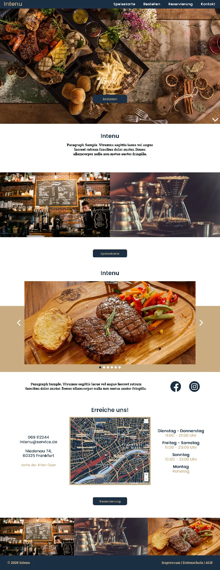
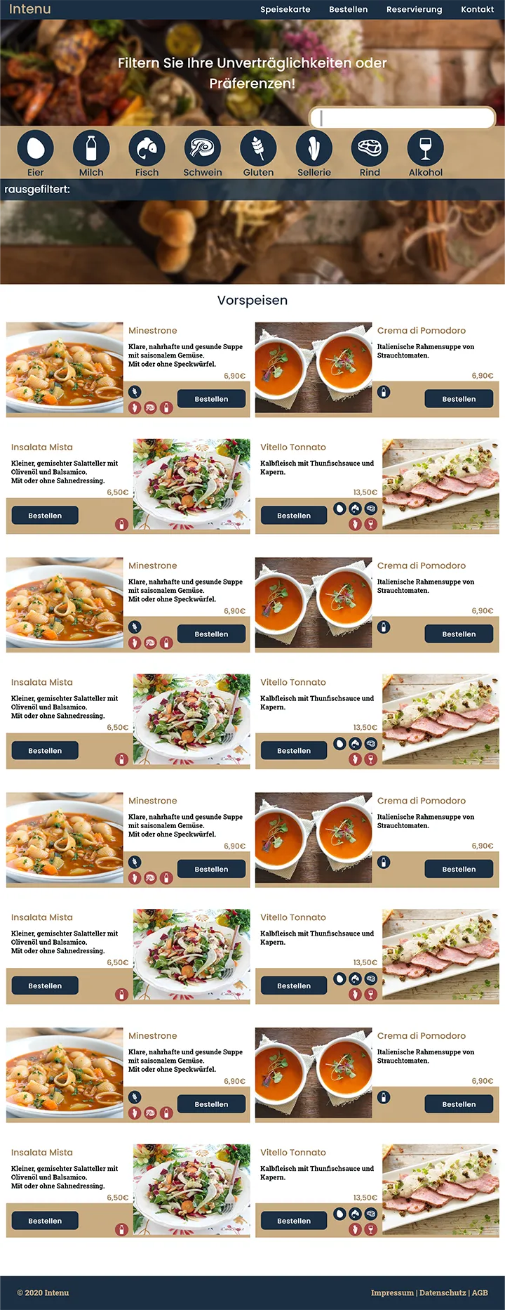
Intenu is a concept for an interactive menu, where you can filter out your intolerances.
2020
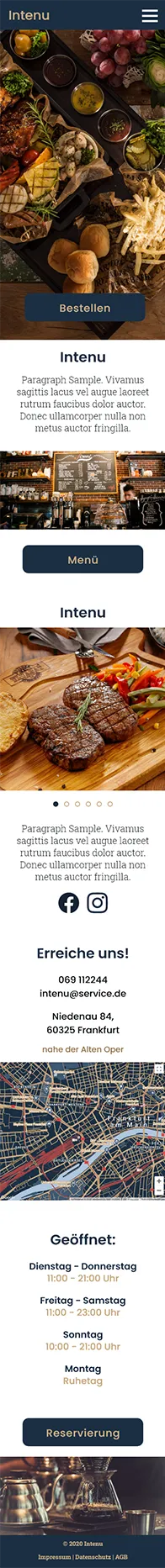
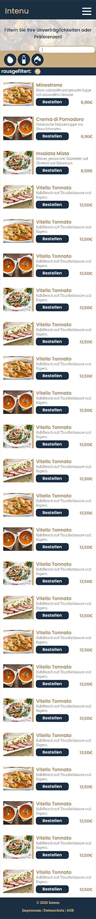
The layouts were supposed to evoke the same feelings as the logo, so being playful and welcoming.
This is being supported by the pastel colours and bright images with earthy colourgrading.
Thus we used a clean but colourful style, a lot of icons and rounded corners. The cards of the
activities were supposed to reseamble real cards.
You can see the layouts for the main page (discovery page), and the sub-page (activity page) for
both the outdoor and the indoor activities.
A set of icons was created for the site.
Those were made to make the site as easy and fast to understand as possible and at the same time as
visual pleasing as possible.