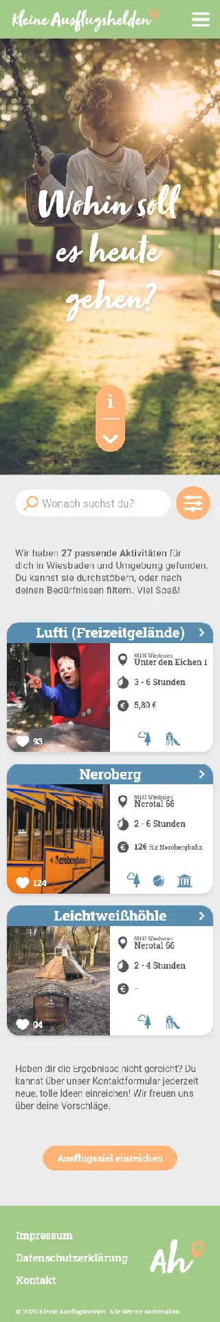
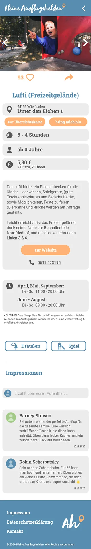
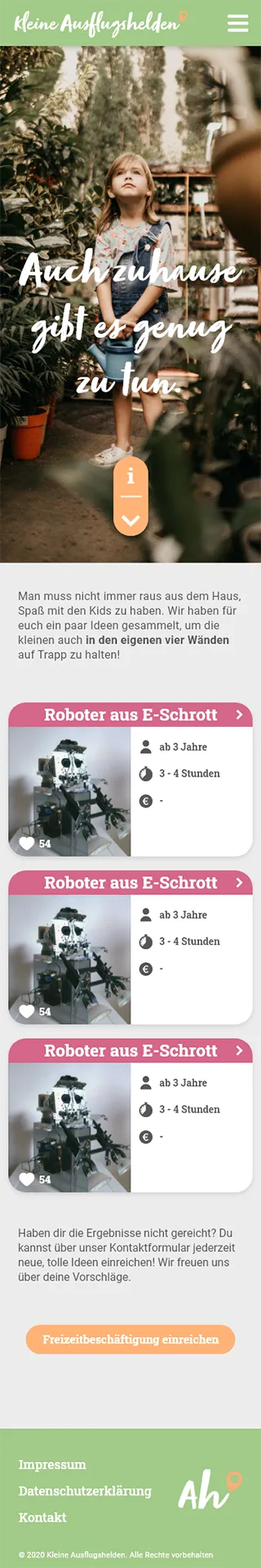
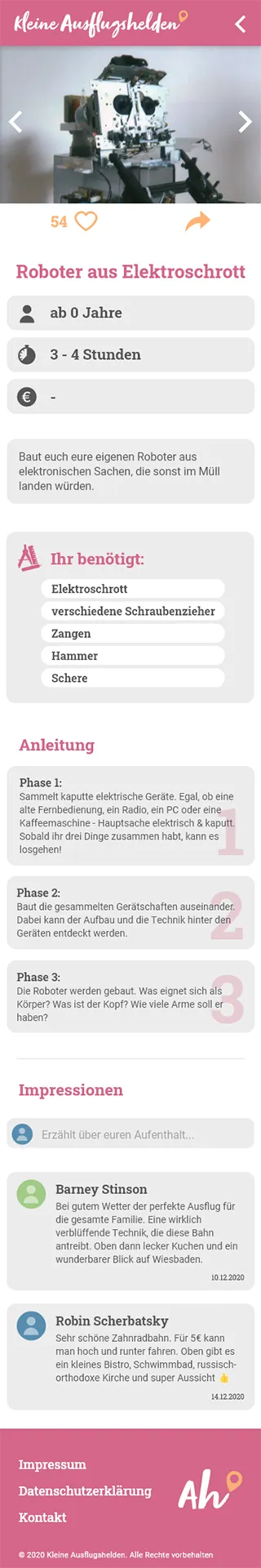
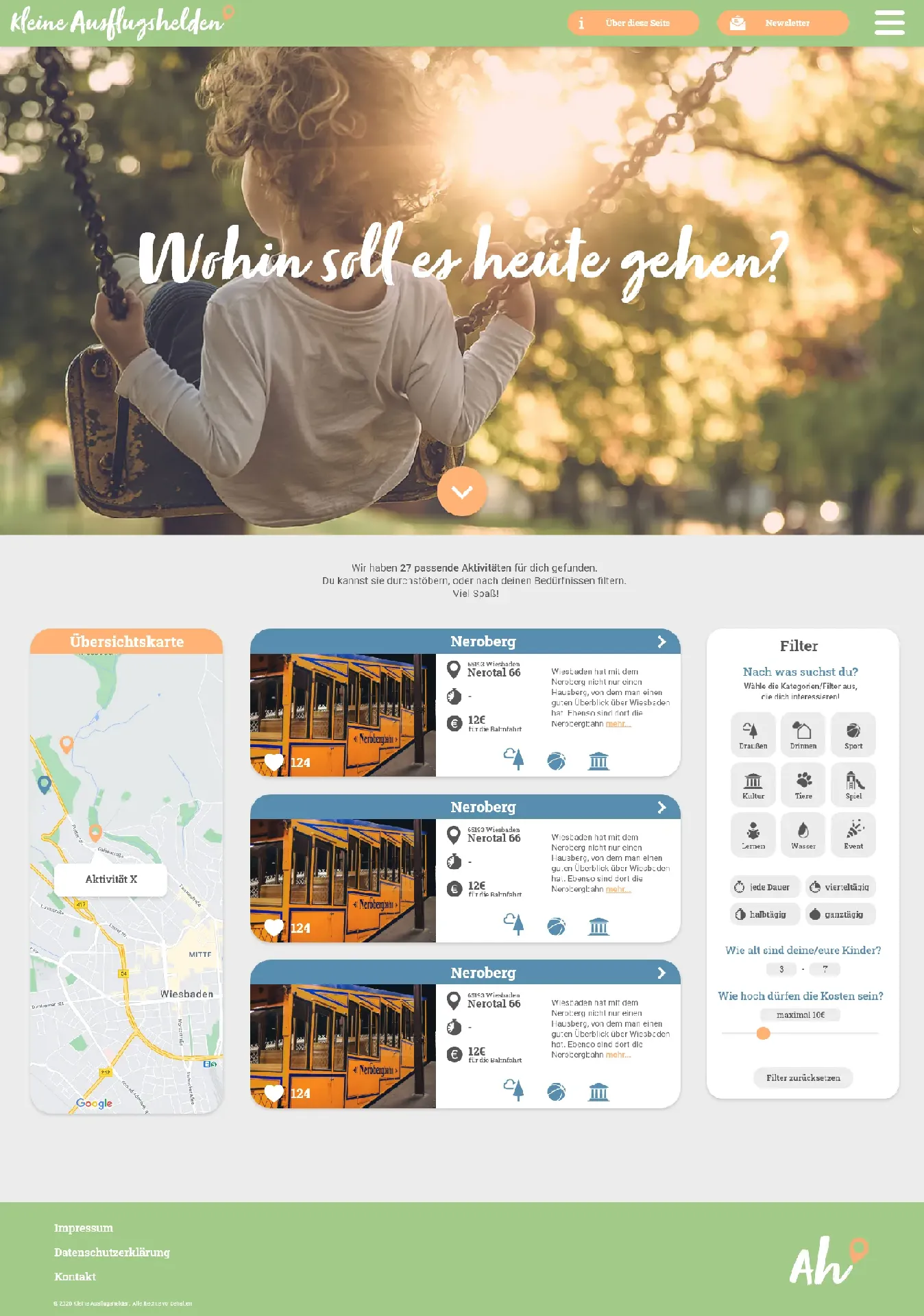
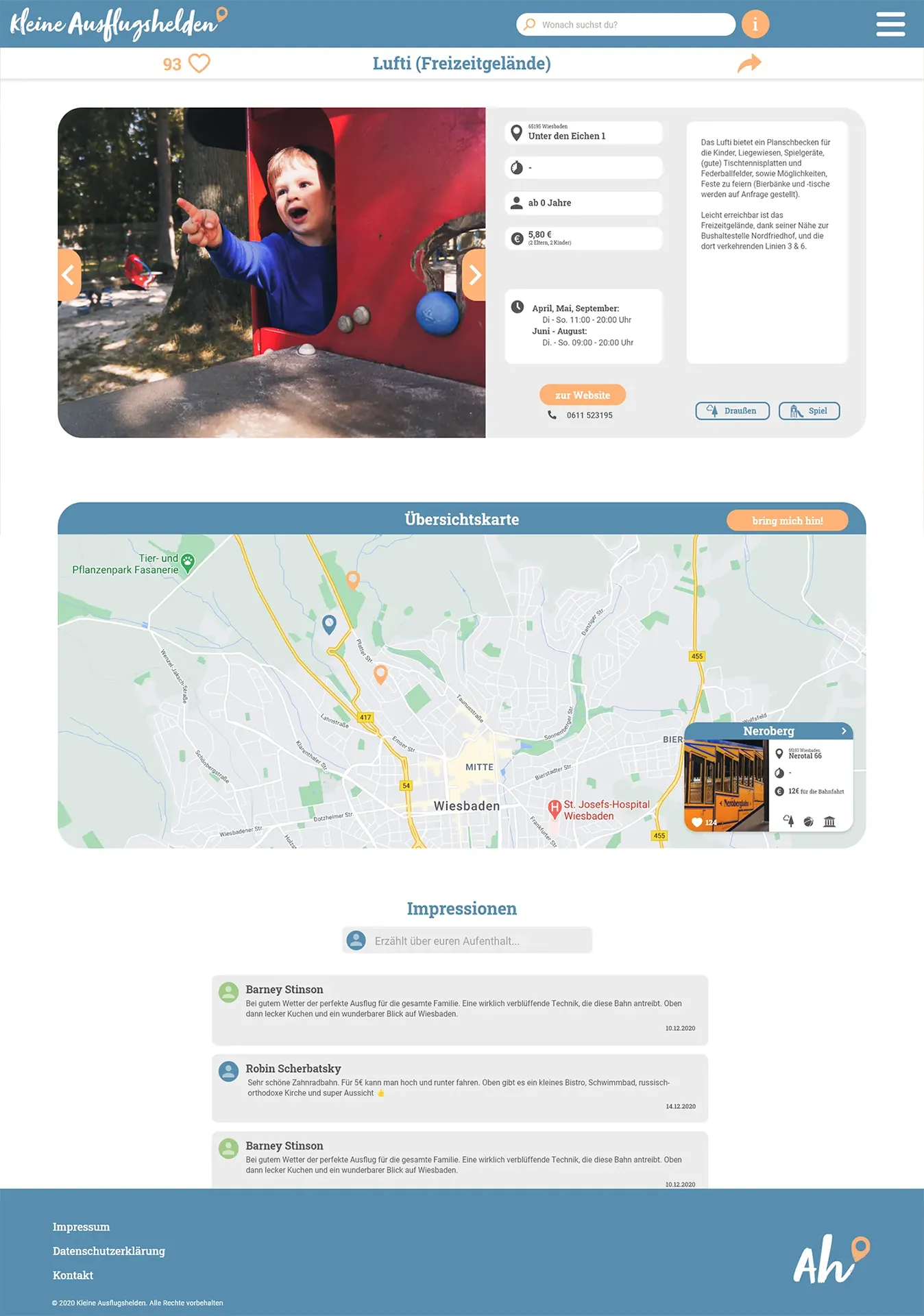
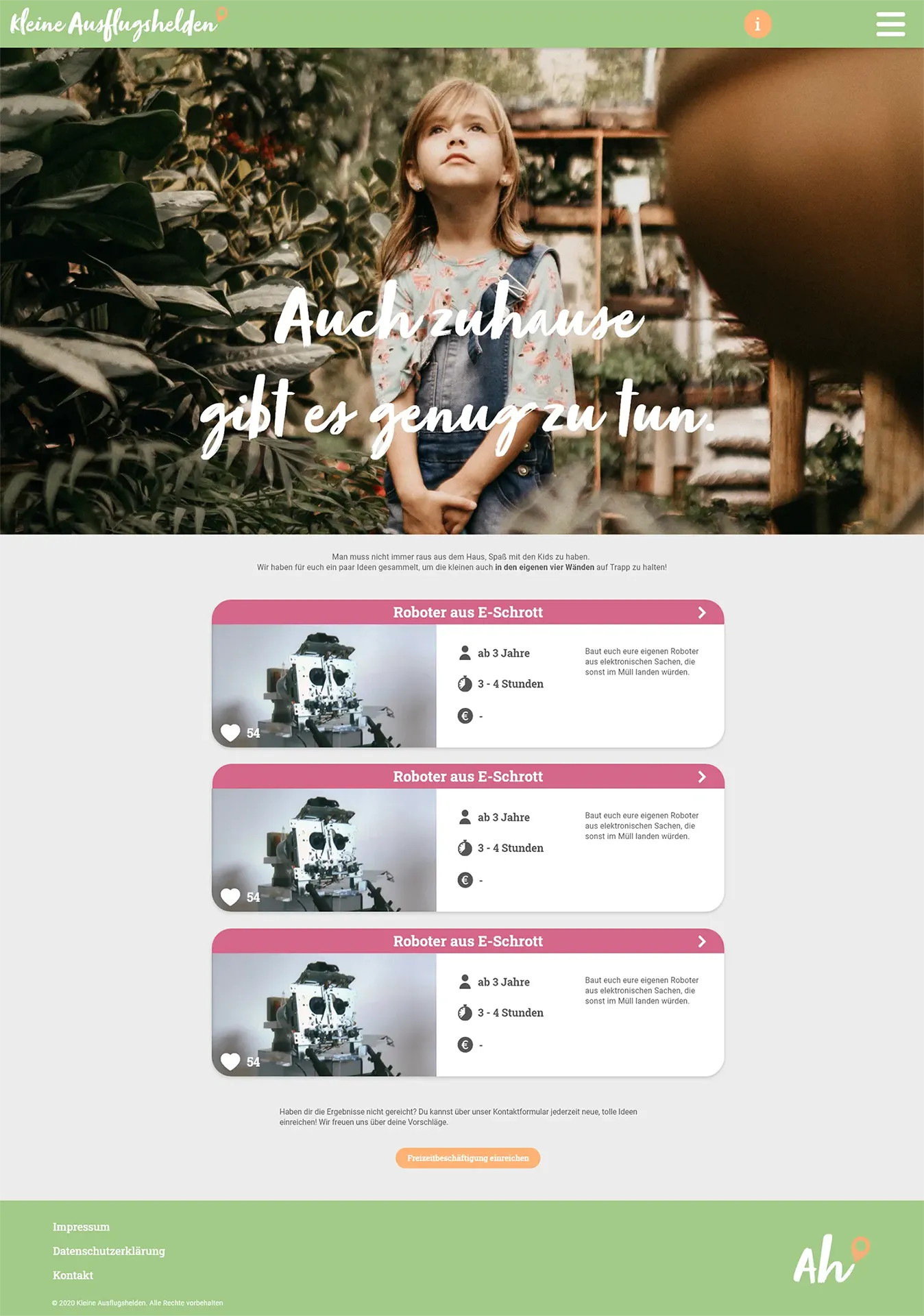
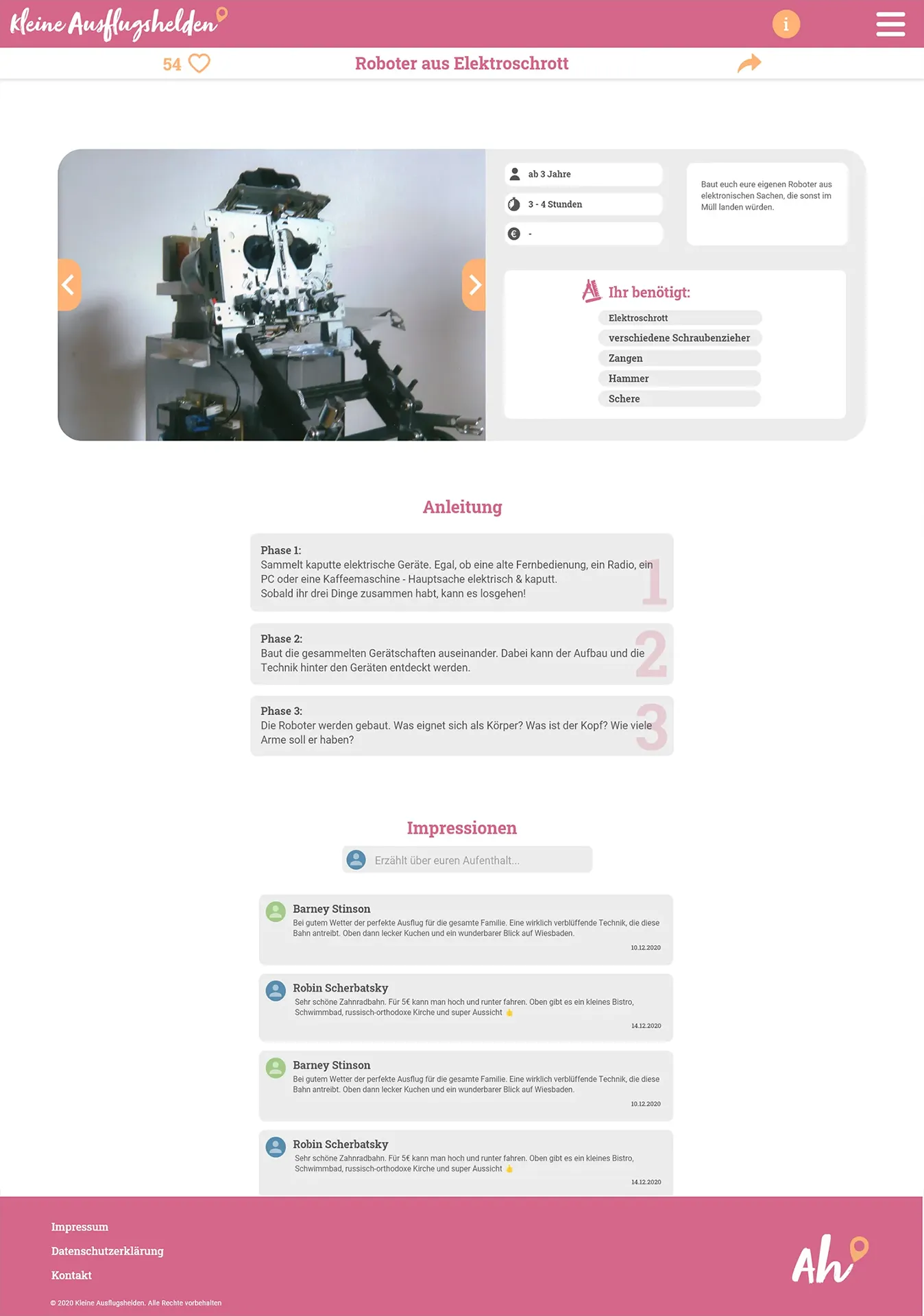
Kleine Ausflugshelden is an university group project. It's a website to discover family-friendly
activities in the Rhein-Main-Area (mostly Wiesbaden).
My responsibilities in this project were ui/ux design, graphic design and front-end-development
(html + css).
2020
The logo is based on the german expression "Ah!" for acknowledging something and picks up the first
letters of the compound word "Ausflugshelden" (Ausflug + Helden) meaning trip heroes.
It was designed to be playful (with the target audience in mind, being kids and young parents) thus
using a drawn style.
The "A" was used as a capital letter, representing the A in Ausflugshelden, but being scaled down to
represent the "kleine" meaning small in the name "kleine Ausflugshelden".
The end of the "h" was used as a kind of path leading to the activities found on the website. On
it's tip the pin represents the location but also acts as the exclamation mark that is commonly used
in the expression "Ah!".
The layouts were supposed to evoke the same feelings as the logo, so being playful and welcoming.
This is being supported by the pastel colours and bright images with earthy colourgrading.
Thus we used a clean but colourful style, a lot of icons and rounded corners. The cards of the
activities were supposed to reseamble real cards.
You can see the layouts for the main page (discovery page), and the sub-page (activity page) for
both the outdoor and the indoor activities.
The layouts have been designed with the "mobile-first" mentality in mind, because users were expected
to use the site to check for activities on the go.
Thus we wanted to keep it simple and fast.
A set of icons was created for the site.
Those were made to make the site as easy and fast to understand as possible and at the same time as
visual pleasing as possible.